Behind the Scenes: How The Silent Journey came to be with Mia Reim and GetCovers!
- Jan 31
- 7 min read
Updated: Feb 6
Hello friends. It has been a long time since I wrote a blog. Too long. LOL. To be honest, writing a blog takes time. I love doing guest blogs when I invited, but mostly I stay connected with my readers through my newsletter. I would share short blog there. If you like to be on the mailing list, feel free to sign up here. But for this special occasion of meeting the pre-orders stretch goal for A Silent Journey, I promised my audience a special behind-the-scenes look of how this gorgeous cover came to be.

For a quick marketing intro:
The Silent Journey is a middle grade historical fiction about a deaf Ukrainian girl who risks everything to reunite with her papa in America.
This story has been in the making for seven years. I worked so hard on to the world. I’m excited to finally launch it into the world.
Before we go farther, I should introduce two guests I am featuring. First, Mia Reim, a freelance artist, is going to share the process of making the cover, and after that, Natalia from the GetCovers, will share about the typography and layout. I had the privilege of partnering with them to make The Silent Journey cover.
Back in summer 2025, I posted on Facebook seeking for a cover artist for a MG project. I got A LOT of responses and went through each one. When I looked at Mia Reim's website, something about her artwork drew me in. She does different styles, but each one has that charm and innocence to it, which I like. I talked to her and from there, I knew I'd found the right person to work with.
Mia Reim: It’s been great collaborating with an author like Havelah. She had a very clear direction but was very open to the inspirations I brought that I thought might suit her vision. It was the perfect combination of vision and openness, every artist's dream client.
I sent Mia two vision boards I had for the cover. I had to do a lot of research to find artwork that spoke the genre and to it being for kids ages 8-13. I chose not to do a graphic cover like the other three books I've published, because, nowadays, Middle Grade covers are illustrated. If I want to fit in with the mass audience, I need to have an illustrated cover. I’m very pleased with the result. Seeing my vision for the book cover come to life is one of the most rewarding experiences I’ve ever had.


Once Mia had my vision boards, she got right to work.
Mia Reim: There were about eight rounds of different loose sketches. They were very rough, so I didn't spend too much time on them since they are meant to figure out the general direction and composition.


When I saw her rough concepts, I was ah, they all looked so good. So many to choose from. Thankfully, I had a few close friends to ask for feedback on which cover stood out. I even asked my older sister, who is a kindergarten teacher, on which one stand out. Once I gathered all the feedback, I narrowed down to this concept!

Readers, I remind you that this version I went with had several round before Mia began to do the coloring. Now we got the cover, Mia, what is your favorite thing to do in the illustration process?
Mia: I think one of my favorite parts of the illustrating process is the detailed sketch. We are still at a stage when we can be more loose but already have a clear direction of where we are going and can focus on the little stuff. Adding details is always fun for me.

I love what Mia did with the full wrap with all the elements (or Easter eggs, as cover designers call it) on the back cover. After we got the layout, Mia began to fill the world with colors. She did a beautiful job capturing the world through the protagonist’s eyes. Mia created layouts for the dust jacket, hardcover laminated, and paperback.
Mia: Coloring is when the world comes to life, at first I do a greyscale to make sure the image is clear and readable and then choose the color scheme.


And after making all those preparations, we add layers of colors. From there it’s usually smooth sailing for me. A bit like a coloring book.

Ah! Mia, the illustration look fantastic! I love it. The details are SO beautiful! After we finished making the paperback cover and dust jacket polished and clean, typography is the next step. This is where Natalia come in.
Natalia: I work with Getcovers. We are a book cover design company creating eye-catching and selling covers for indie authors. We work with all possible genres. Not only that, we’re a big in-house team of experienced designers who are always learning, improving, and keeping up with what actually sells in today’s book market. Our designers know what exactly work for each genre and how to attract book’s target audience.
It's true. They have done other covers for me in the past. Now the typography can be a lengthy one.
Natalia: Typography usually comes at the final stage of the cover design process, once the main visual is already in place. Firstly, we always start by learning the author’s request and wishes.Sometimes an author already has certain font styles they like. Our role as professionals is to make sure those fonts truly work, so that they fit the genre and overall style, blend well with the composition, and remain easy to read. Here are few examples we did.


It’s also extremely helpful when an author can share what kind of emotion they want the cover to convey (yes, fonts, just like colors, communicate mood and feeling). We also dive into the book itself: the genre, a short blurb, and key story details. All of this helps us choose typography that supports the story and strengthens the final design.
While I like aspects of the samples I was seeing, something was missing. Something was not quite right. Do you ever get "THIS IT IS!" feeling when you know it is exact right one? I needed to feel that. There's several important factors when choosing font.
Natalia: One of the most important ones is readability. Readers don’t always see a cover at full size; very often, it’s just a small thumbnail. That’s why the title has to stay clear and readable at different sizes. This also means paying close attention to color contrast and making sure the typography doesn’t blend into the background or get lost in the overall composition. The font should stand out just enough to be instantly readable. It’s also important to choose fonts that will work eventually, not just ones that feel fashionable right now. Books tend to live much longer than design trends, so typography should look relevant years ago.
I agree with her. Font is important. It needs to convey the genre and vibes, and also need to stand out and be readable. I strugggled to find the font I wanted to use for The Silent Journey. Natalia and I kept working on it, searching diligently for the right font. I even reached out to few friends for feedback. The typography kindly sent me the link to where they purchase fonts. There I selected the fonts I loved for Natalia to use. Here are few images of designs we considered. We are getting close to the final piece.


Natalia: There are many parts of the process we truly enjoy. One of them is building the first concept. That moment when you dive into the story details, and the author’s wishes, and the first ideas start forming in your head. Then you begin searching for the right visuals, and those ideas keep growing and evolving. We also love the moment when everything clicks, when all the separate elements finally come together and start working as one cohesive whole. And, of course, seeing how typography transforms the cover's final look. Without it, a cover can already be visually strong, but it still feels unfinished. Then the right typography clicks into place, and suddenly, everything feels complete.
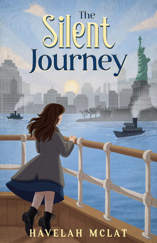
I'm so glad we found the right font! I'm proud to say this is the final product cover for The Silent Journey. (Notice there are specially crafted layouts for the paperback, laminate hardcover, and dust jacket versions of the cover.)

Paperback

Laminate Hardcover

Dust Jacket
Thank you Mia Reim and Natalia for being part of this special blog and sharing your experience with my readers. I’m forever grateful we worked together to bring my dream cover to life. I can’t say it enough: I had a wonderful experience working with you both! I asked Mia and Natalia to share about their services and where to follow them on social media. Future authors, if you are seeking fantastic artists to collaborate with you on your book cover, check out Mia’s website and contact Natalia at GetCovers. You won’t regret it!
Mia Reim: I am available to find on instagram ( mia.reim.illustrations ), linkedIn ( Mia Reim ) and on my website ( https://miareim.com/ ).
Natalia: Here are our website https://getcovers.com/ and social medias:
Instagram — https://www.instagram.com/getcovers_design/
Facebook — https://www.facebook.com/GetcoversDesign/
YouTube — https://www.youtube.com/channel/UCqB5Tzbvd-jD8g3phj8YWoA
Pinterest — https://www.pinterest.com/getcovers_design/

If you like books that have:
Feature a disability protagonist like Show Me a Sign.
Escape the famine-ravaged country like The Lost Year.
Dare adventure across the seas to America of A Sky Full of Song.
Found family and friendships of A Little Princess.
The Silent Journey is for you.
Available for preorder: https://www.amazon.com/Silent-Journey-Havelah-McLat-ebook/dp/B0GCQ2GDXT
Add The Silent Journey to your Goodreads TBR: https://www.goodreads.com/book/show/240094461-the-silent-journey
Edited by Veronica Lynn.


Comments